Five Shades of Germany
Together with Jonas Parnow I created an infographic article on similarities between major german cities based on Census data of 2011.
We picked an odd combination of five criteria that would be our metric of similarity. We wanted to determine the two most similar cities – a twin pair, if you will. How can you do that? By measuring the multi-dimensional distance (the sum of distances in each category) between every possible city pairing.
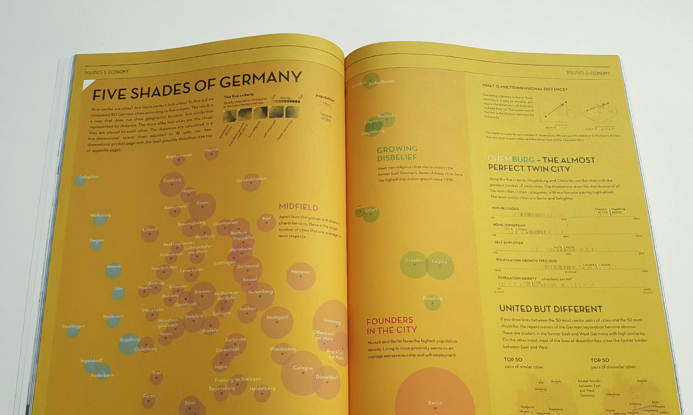
This calculation can be used to map any number of dimensions onto a two-dimensional canvas, as Julian Stahnke elaborated on in his bachelor thesis, which was the foundation of our main graphic – a flat map of germany, reordered by data, pointing out clusters of cities with similar traits.
The most similar in all aspects were Chemnitz and Magdeburg, two cities located in the eastern part of germany.
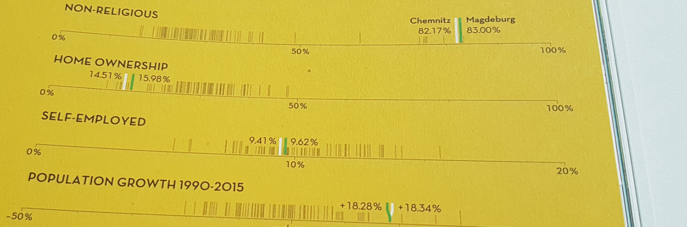
Closeup of the Strip-Plot series. You can read the Making-of on my blog.
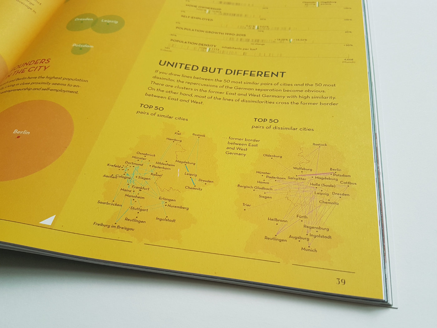
We then became interested in where the other cities with high similarity were located geographically. By looking at the Top 50 most alike cities, two clusters emerged, following closely the border of the former German Internal Wall. In contrast, the biggest dissimilarities showed up across that border.
Here I Stand
While working at Infographics Group, I created a series of interactive infographics for here-i-stand.com, an online exhibition dedicated to Martin Luther and 500 years reformation.
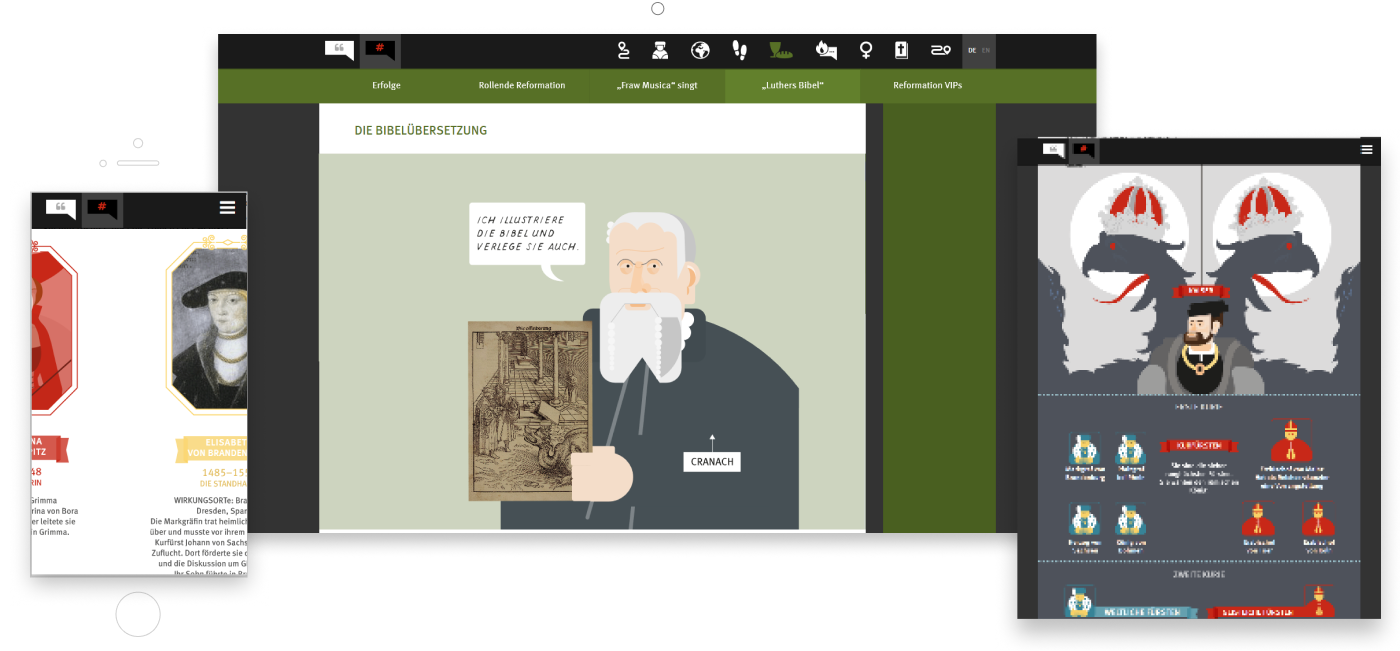
A selection of some of the interactives at different screen resolutions. All artwork by Infographics Group.
Our team already had 30 infographic posters on different topics about Martin Luther done. Next, we wanted to integrate them into the exhibition website. Since this was a lot of work to be done, I needed to create a uniform guideline for the artists to follow and make it easy for them to refactor their print graphics into interactives.
First of all the graphics had to be responsive and therefore had to be adjusted for different screen resolutions. To speed up the process of converting them into html, I introduced the wonderful ai2html script to the team.
It basically converts all artboards in the Illustrator document into html blocks, placing all image content in the background and all textual content on top of the image as html text. This way the text will render nice and readable in the browser.
functionality of the ai2html script
Another important step in the planning was to predefine a limited number of interaction types, so that I wouldn't have to custom-code every single graphic. We restricted ourselves to zoomable maps, carousels, scrollable animations and plain old static graphics.
For each interaction type, a gulp-task combined the html-fragments (exported by ai2html), 3rd party libraries (jquery, skrollr, slick, etc.) and individual javascript code into one self-contained interactive that could easily be plugged into the website.
With this setup, changes could be done by simply updating the Illustrator files and rerunning the scripts.
Illustrator artboards turned into a carousel interactive
Procedural Literacy
In regards to the ongoing digitalization of everyday life, we must consider that the ability to communicate with machines will become as important as today's reading and writing.
Algorithms already affect the better part of our digital and analog reality. In my Bachelor Thesis, I aim to reveal the inner workings of those invisible processes.
This work was done under the presumption that programming will become the next cultural milestone in education. Being »procedurally literate« means understanding the process flows necessary for computer programming.
In 2013, Barack Obama urged the American nation to embrace computer science. This call can be regarded as an attempt to face the increasing digitalization of life and the uncertainty that goes along with it.
All around us, we are witnessing a steadily ongoing process in which the natural world is being projected into its digital counterpart.
In this virtual world view, information on everything and everyone will become available not only at runtime, but at every point in time of the past as well.
Algorithms help us keep an overview of this information cosmos. They work tirelessly to bring order to the data chaos and make the requested information available to us.

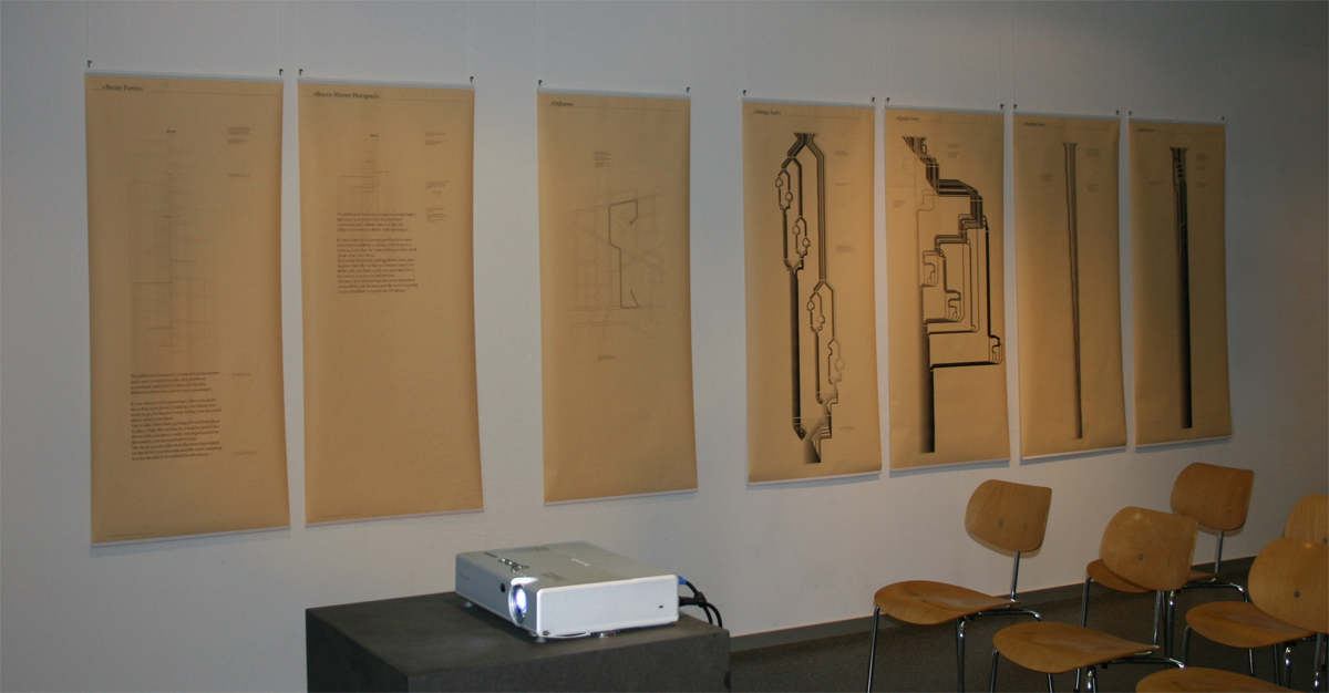
My visualizations focus on the formal examination of programmatic structures and on the creation of visual models to illustrate the selected algorithms. The intention is to show as much and to explain as little as possible of the process in order to generate a general understanding of the sequence through mostly visual means.
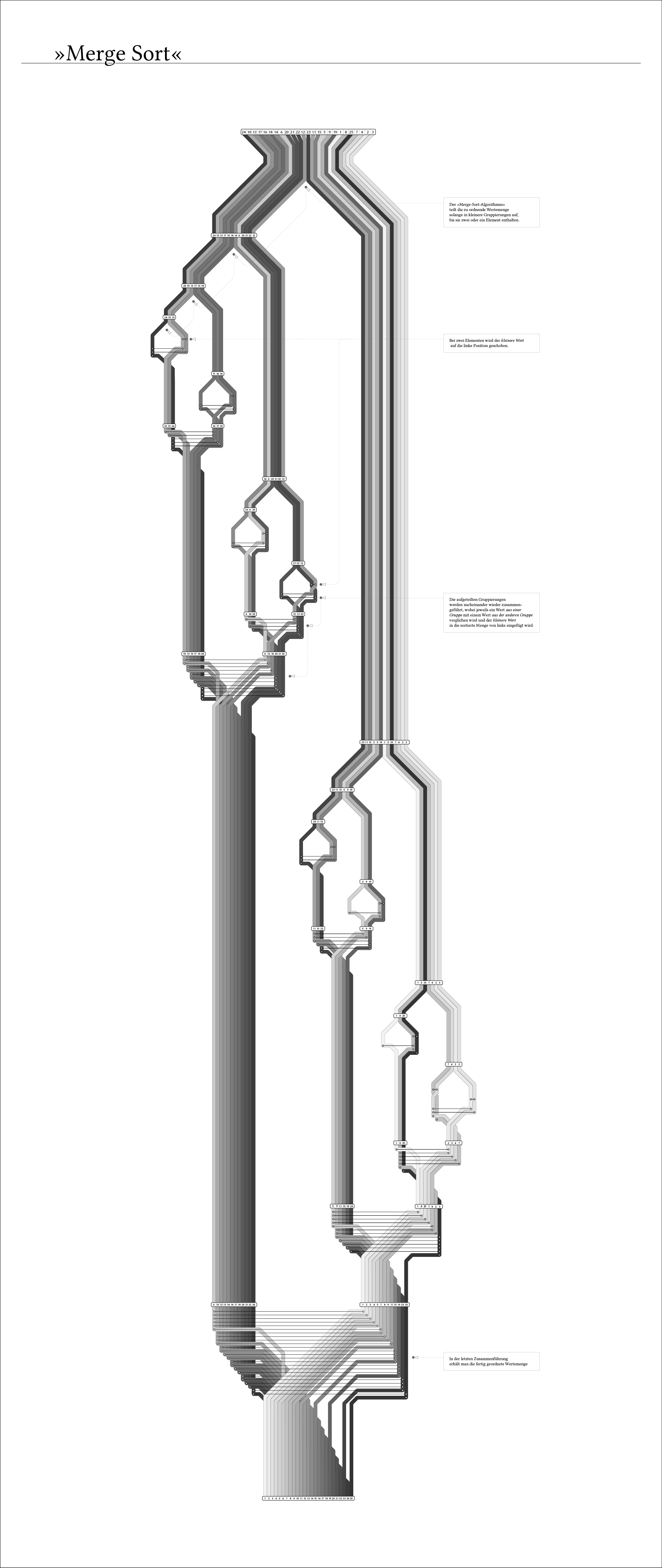
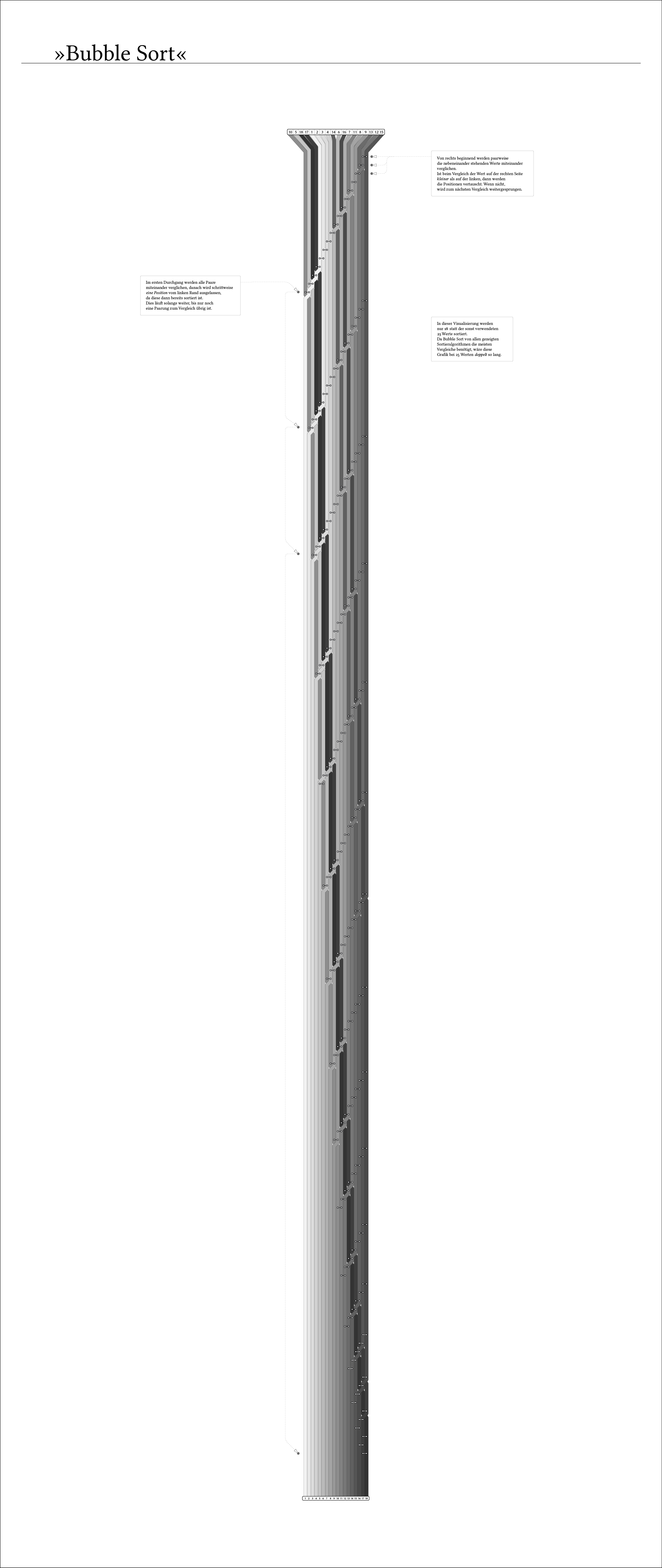
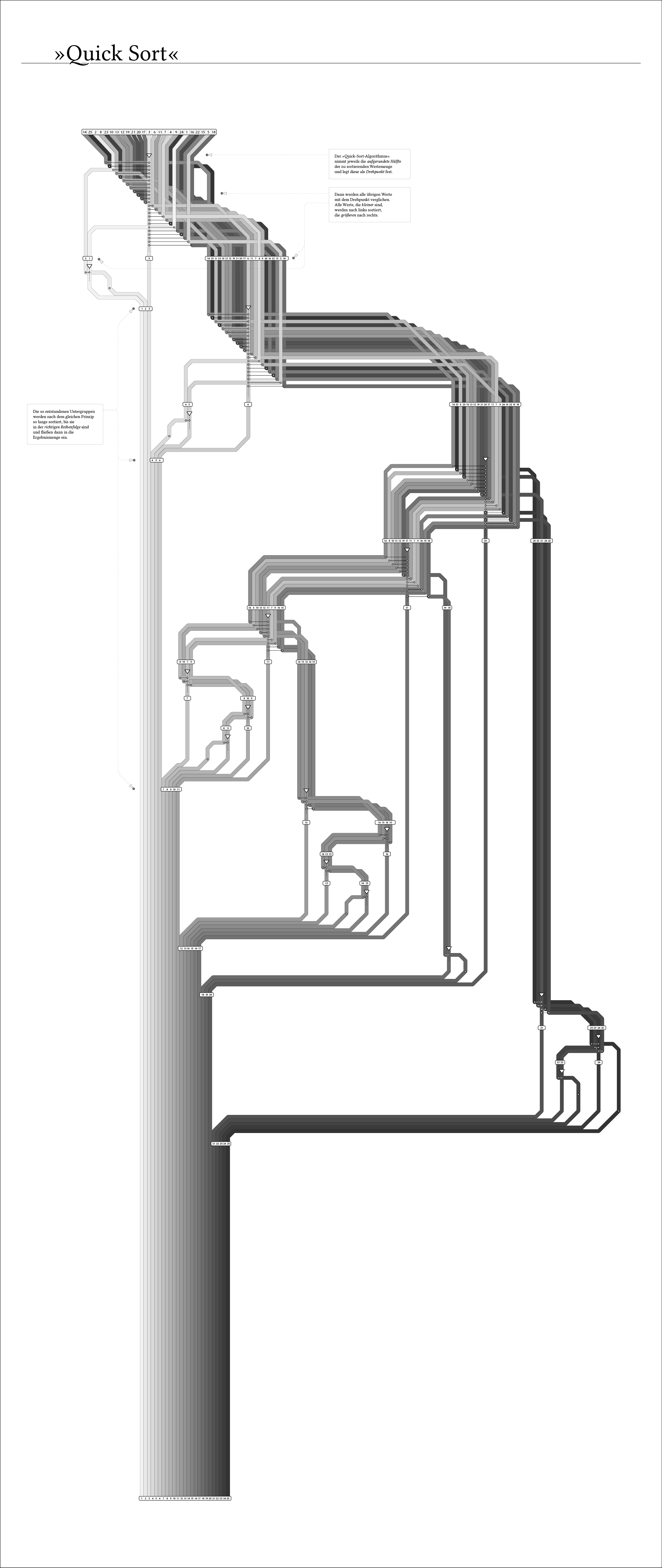
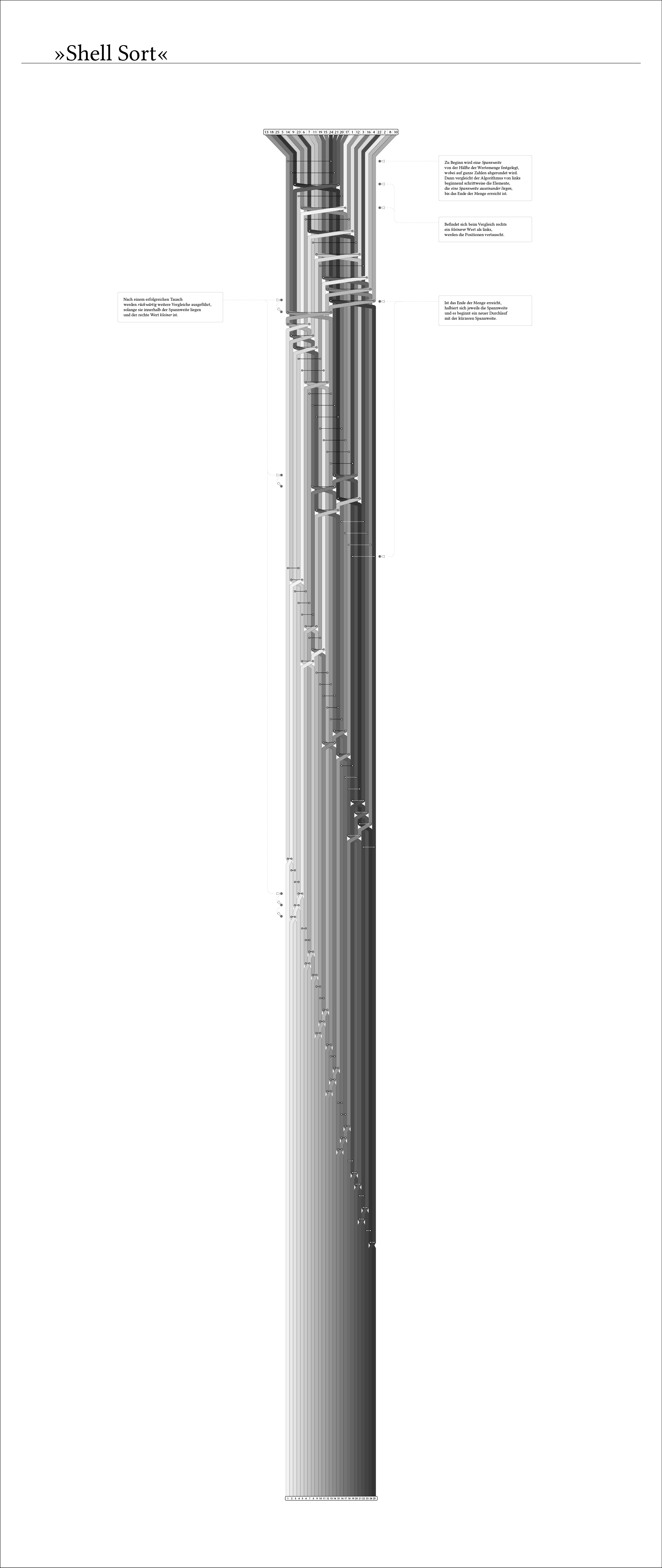
Sorting algorithms: Mergesort, Bubblesort, Quicksort and Shellsort
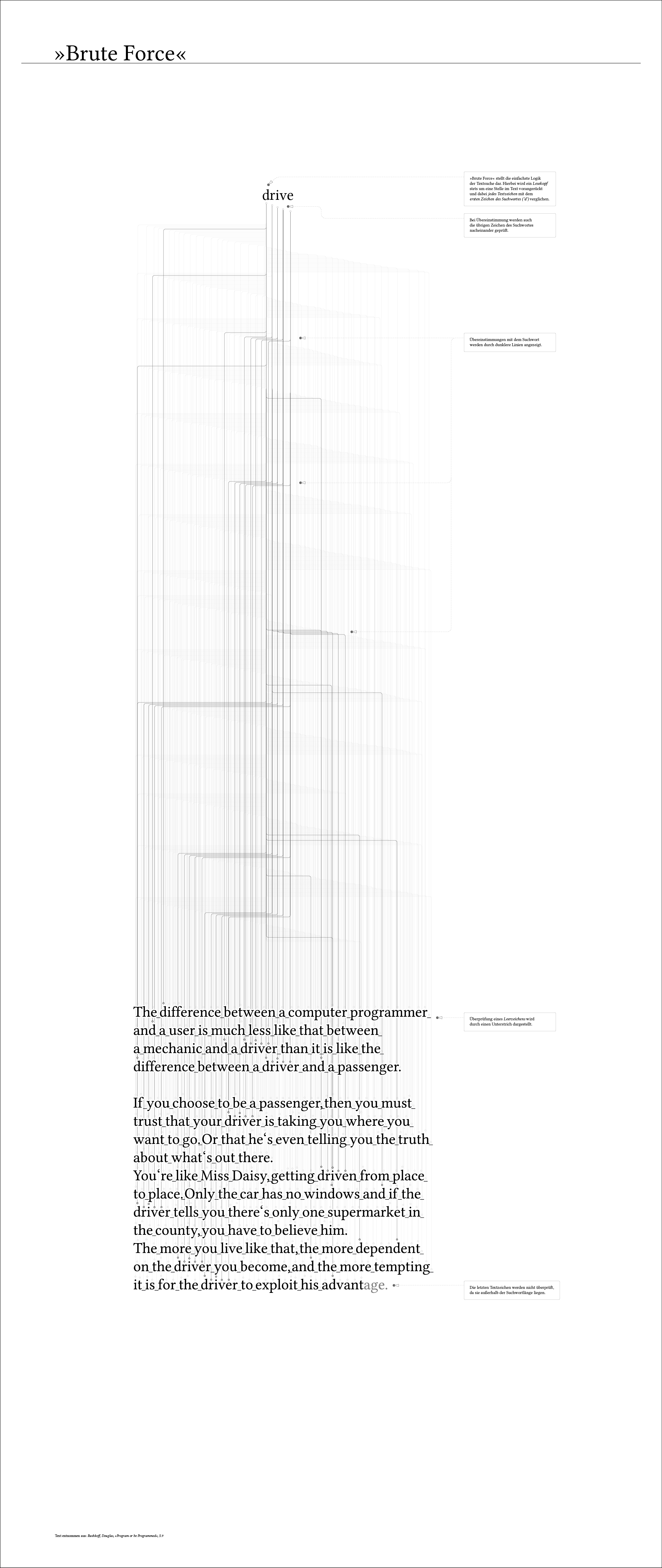
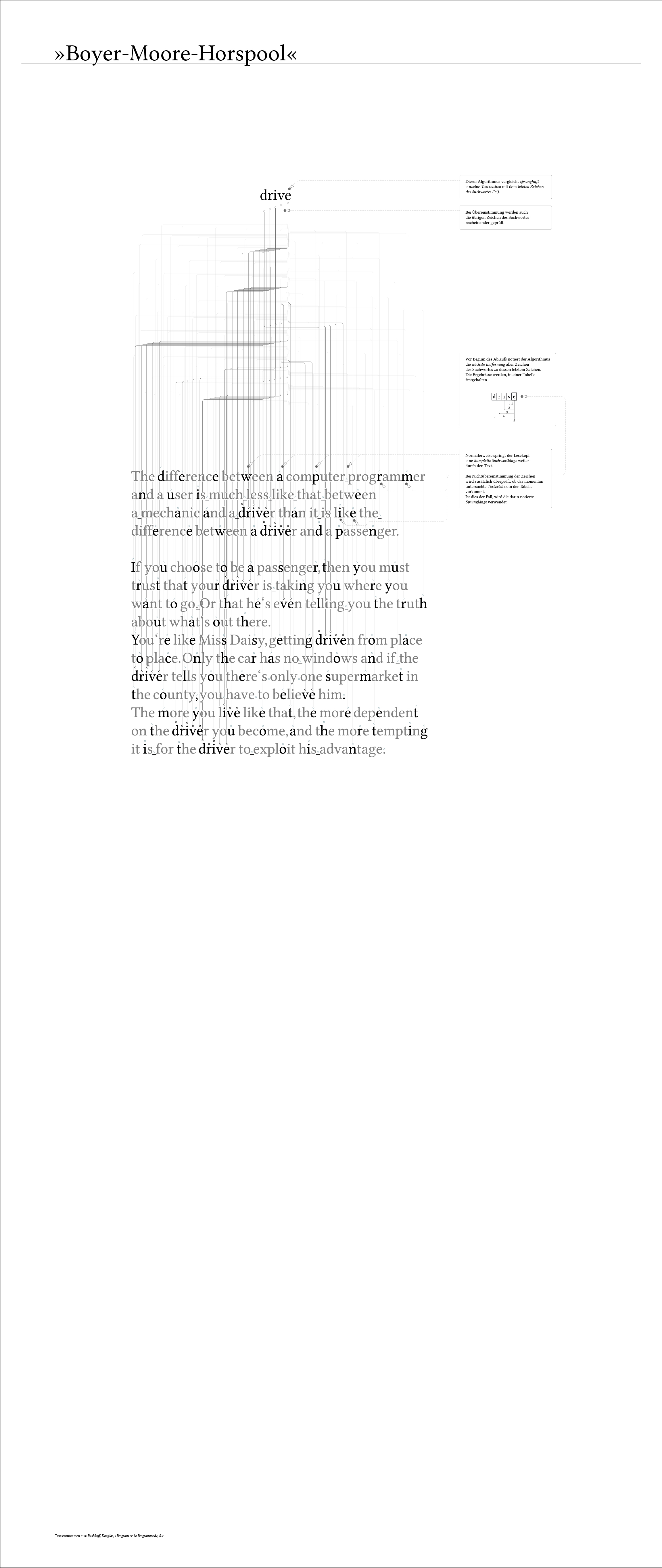
Textsearch algorithms: Brute Force and Boyer-Moore-Horspool
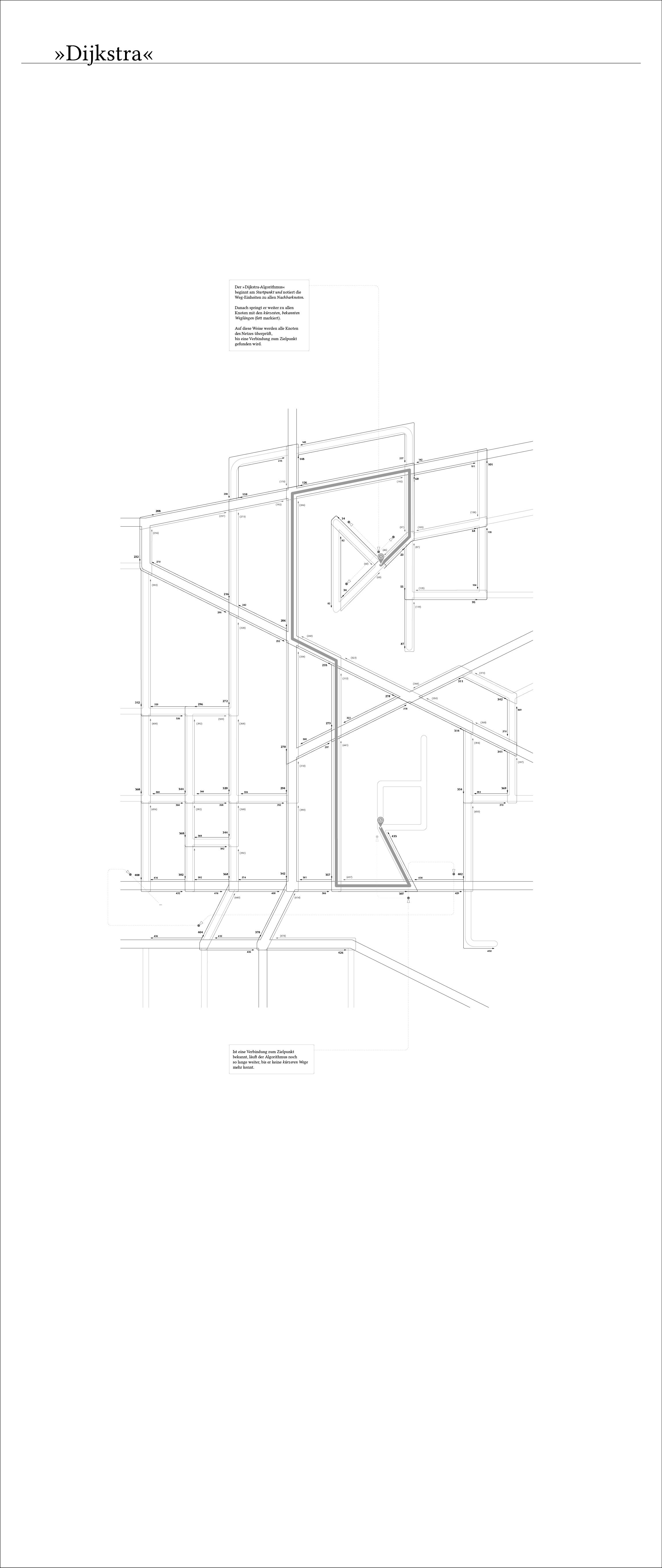
Pathfinding algorithm: Dijkstra
Visualizing Politics

This project aimed at making political positions visible and at showing the complex processes behind the decisions that affect all societies.
We started with an analysis of a current article from the »Zeit Online,« extracting the arguments from the text and putting them in a visual nutshell. We decided to focus on a debate about minimum wage, as we had found two very opposing articles that nicely illustrate the pros and cons surrounding the debate.
We evaluated the arguments from the texts on a self-developed scale using three opposite pairs
(social / economic, factual / hypothetical and
objective / polemical) and three grades of intensity. Each argument was then displayed as a hexagon, and, at the end, all arguments were overlapped to create an overall view of the style of argumentation.
Our major task focused on the »German School Reform,« a very current topic at that time. Our main concern was the transition from primary to secondary school, as each federal state had its own system. Four or six years primary school? And who decides: teachers or parents?
The majority of our data was drawn from a huge table compiled by the Federal Statistical Office for the academic school year 2008/2009. We created a series of visualizations for school career, numbers of degree holders, pupil numbers per grade, as well as results of the PISA studies. Subsequently, a prototypical website was designed allowing the user to filter by topic and federal state.
Numbers of degree holders of all federal states by degree
Average pupil numbers per grade
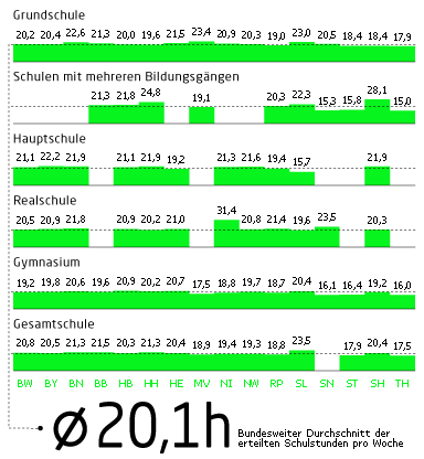
Average number of school lessons per week by federal state
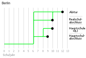
School career in Berlin, 6 years primary school, few possibilities to switch
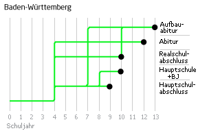
School career in Baden-Württemberg, 4 years primary school, multiple possibilities to switch
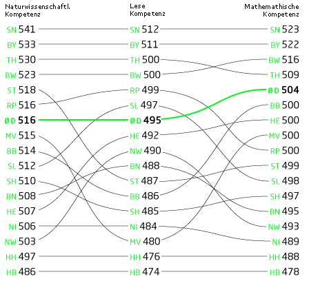
PISA points by competence (science, reading, mathematics), comparing all federal states (2006)
Drawn Sentences

This project is about the concurrence of image and language.
For a language study at the Linguistic Department of the University Potsdam, a series of action-depicting drawings was created.
My task was to draw one hundred images based on action descriptions. The images were to remain uniform throughout the series. To create this mass of drawings efficiently, I created a base figure that I could rearrange depending on the description at hand. This pose was then used as base for the composition of the image.
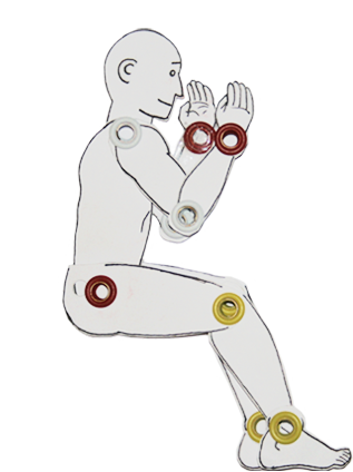
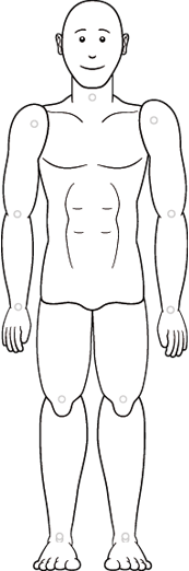
Jointed doll of a male base figure
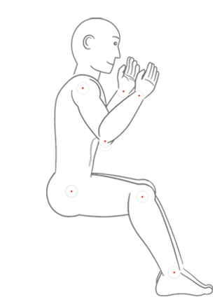
The pose of the doll was recreated in a vector drawing and printed on paper with a light grey
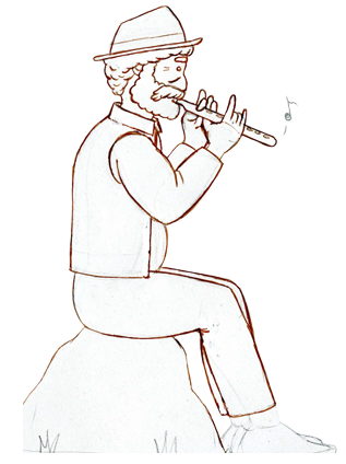
The printed model was then drawn over according to the depiction: e.g.»The shepherd is playing the flute«
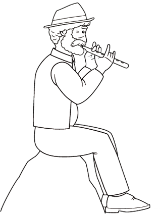
The drawing was then scanned and finished as a vector graphic
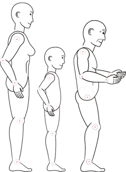
Alternating base figures: woman, child and old man
Male base figure in front view
The longer parts of the sentences were descriptions of actions with a male subject (the farmer, the cowboy, the thief…), but there were also sentences about female protagonists, children, and the elderly that generated the need for new base figures. In addition, small parts of the descriptions could not be displayed well in side view, so an additional male base figure in front view had to be created.
Below are all one hundred drawn sentences from the series shown with their corresponding action descriptions (in German).
{{slide.text}}
Berlin Music Map
The application was displayed at the »Berlin Music Week 2010.« It showed music events based on data by hooolp.com on a hand-drawn, illustrated map of Berlin.
During my internship at interactive scape I created this multitouch-application in cooperation with »hooolp,« an online database for concerts and events.
When touching a marker, an information window opens with a detailed description of the event. The denoted events can be filtered by date and genre.
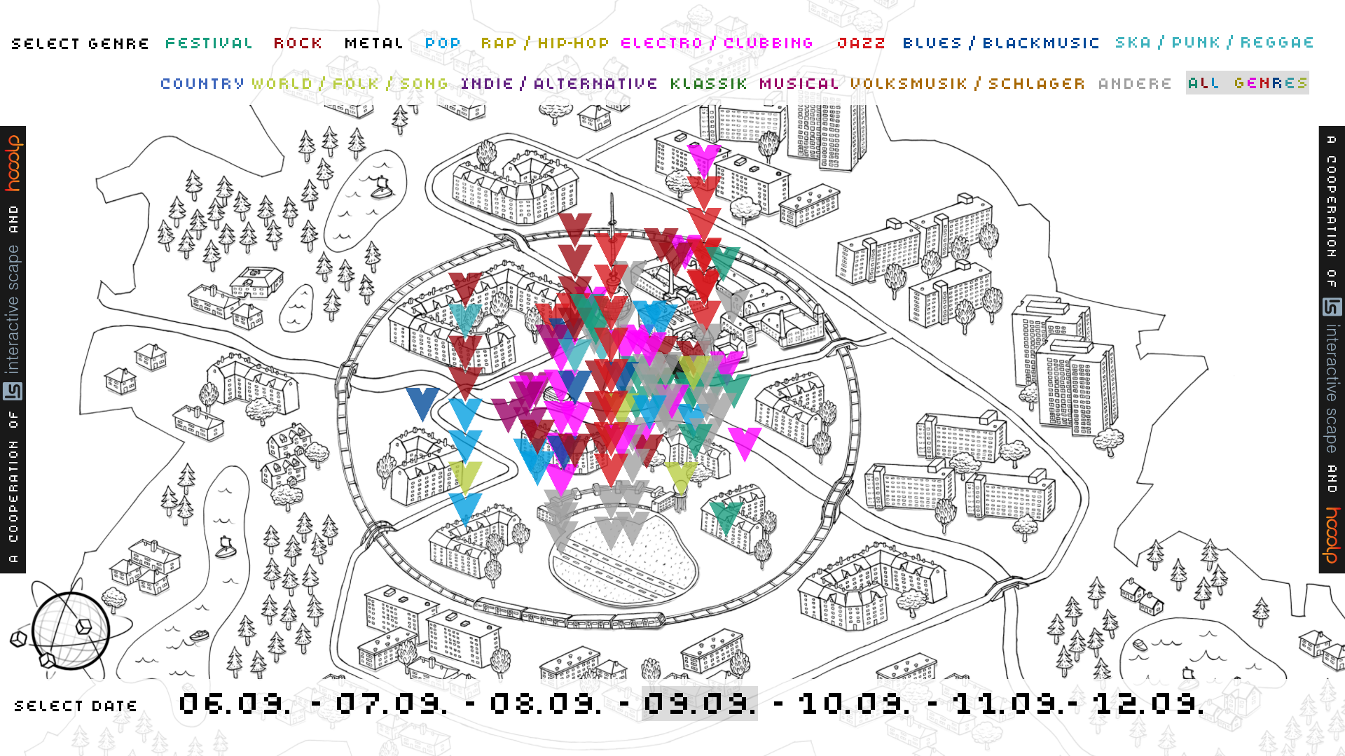
Different zoom levels show diverse details
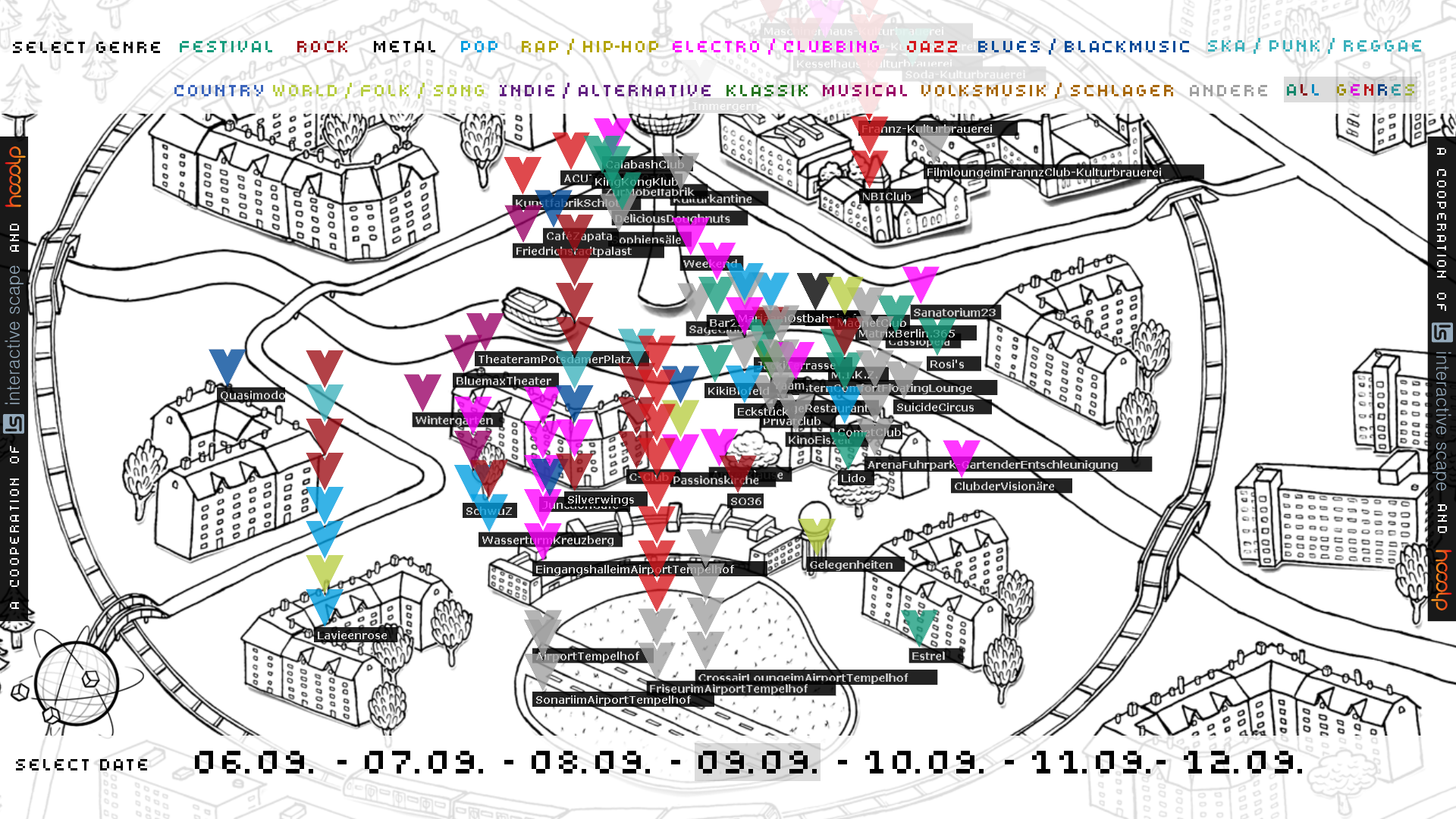
On a deeper zoom level, the names of the venues become visible